
Redesign
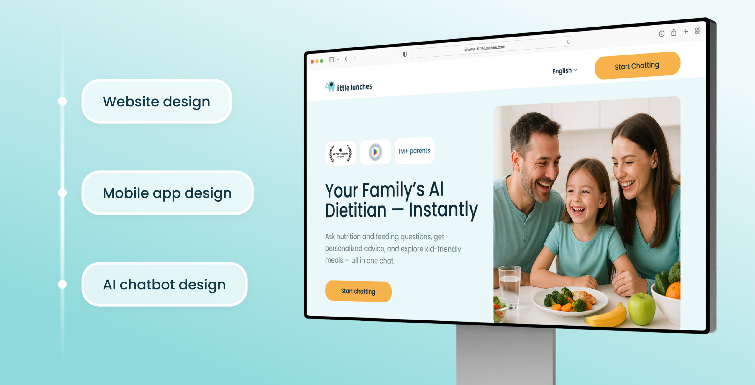
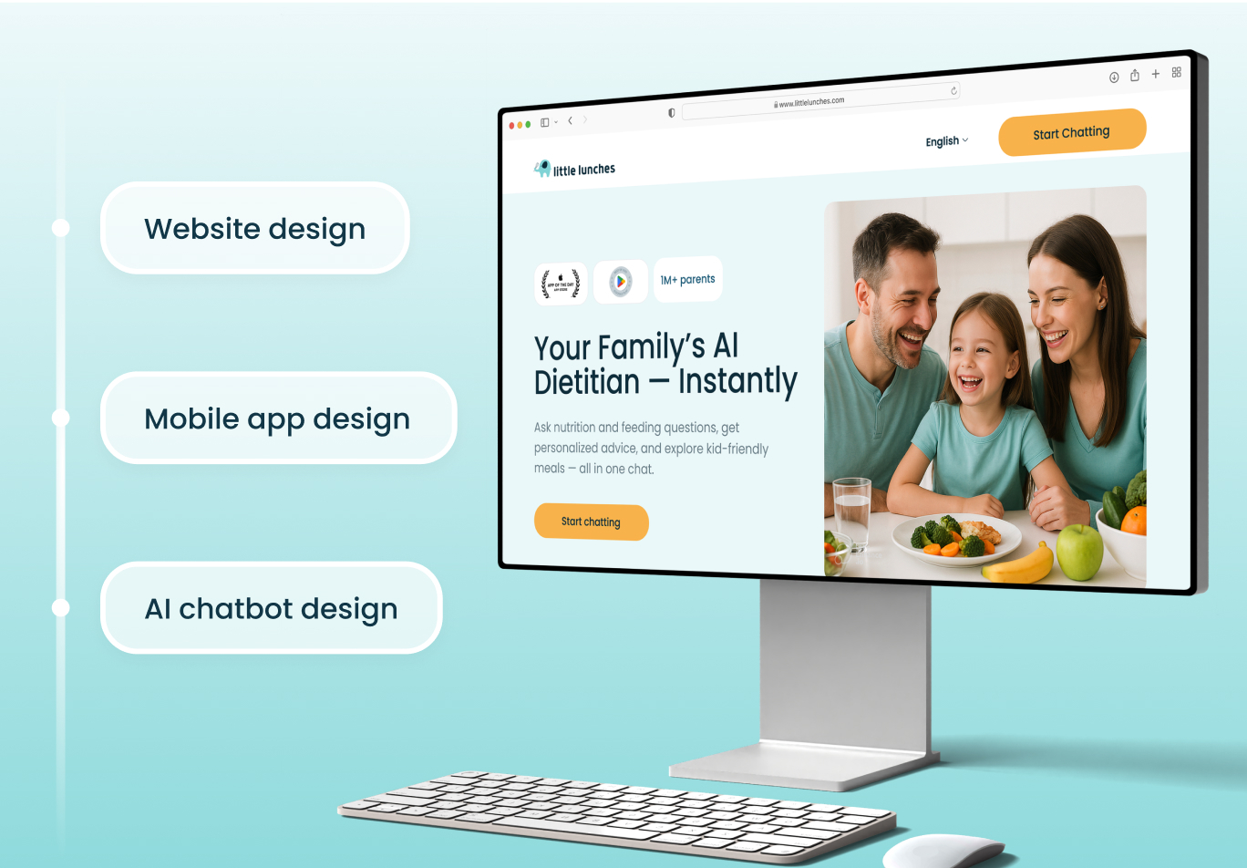
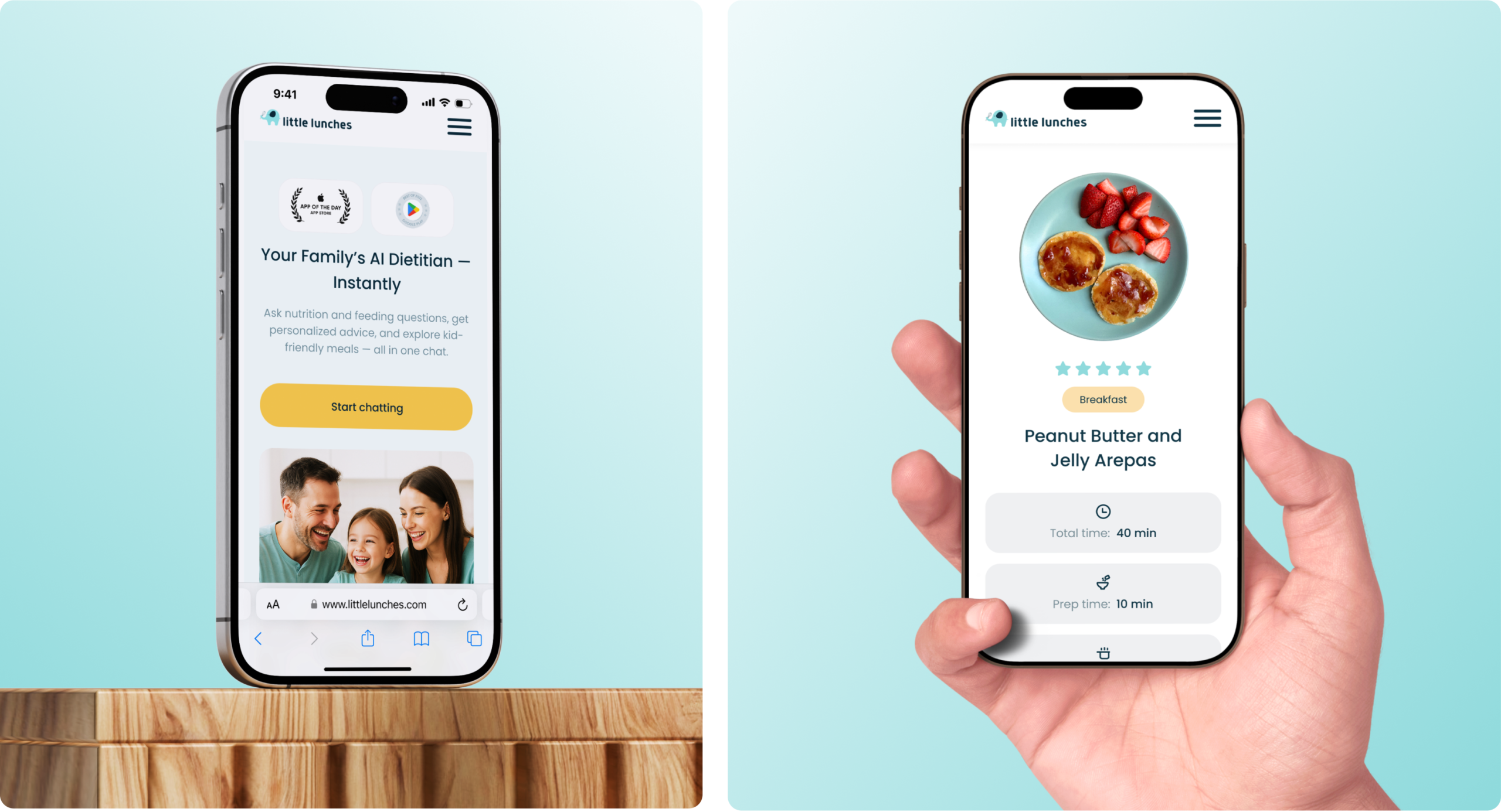
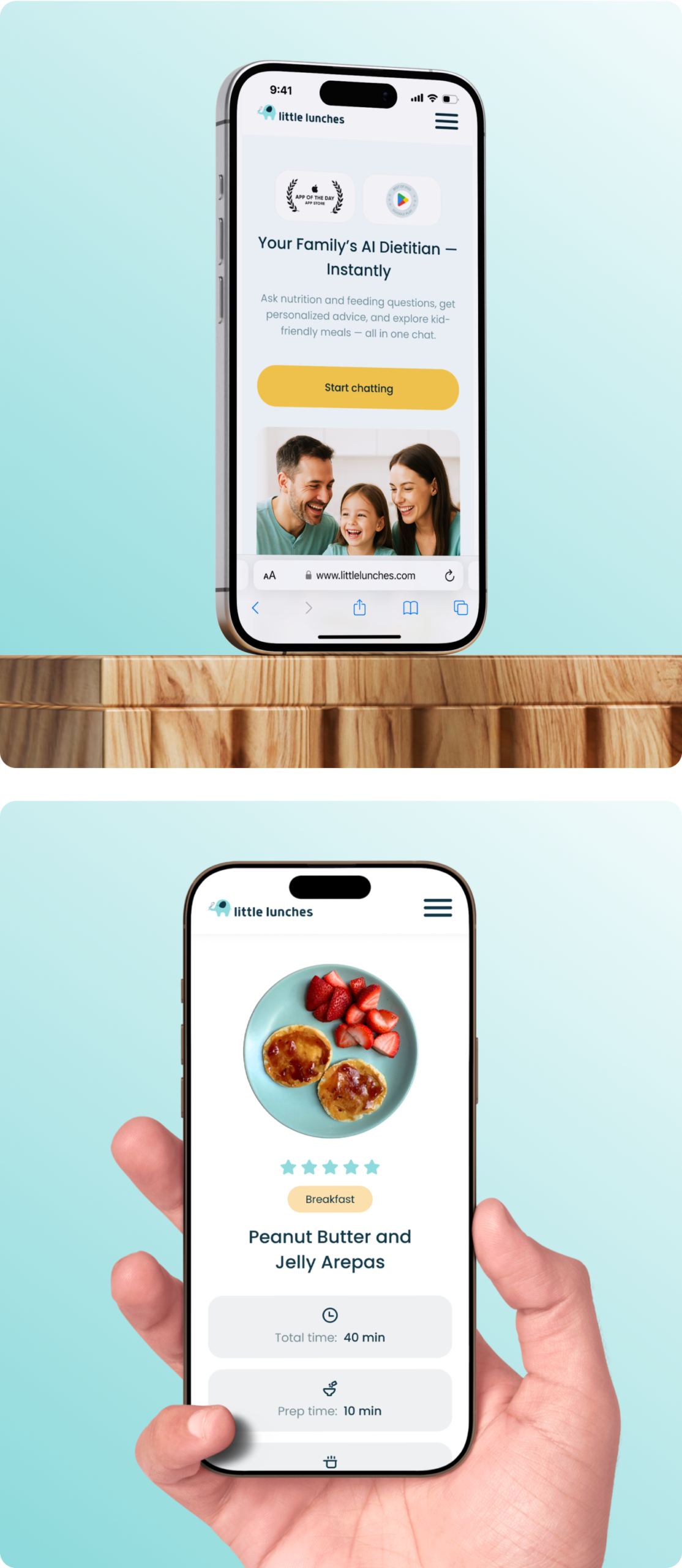
Little Lunches went through a full redesign of both the mobile app and the marketing website, with a focus on improving UX, visual consistency, and user engagement across all touchpoints.
App Design
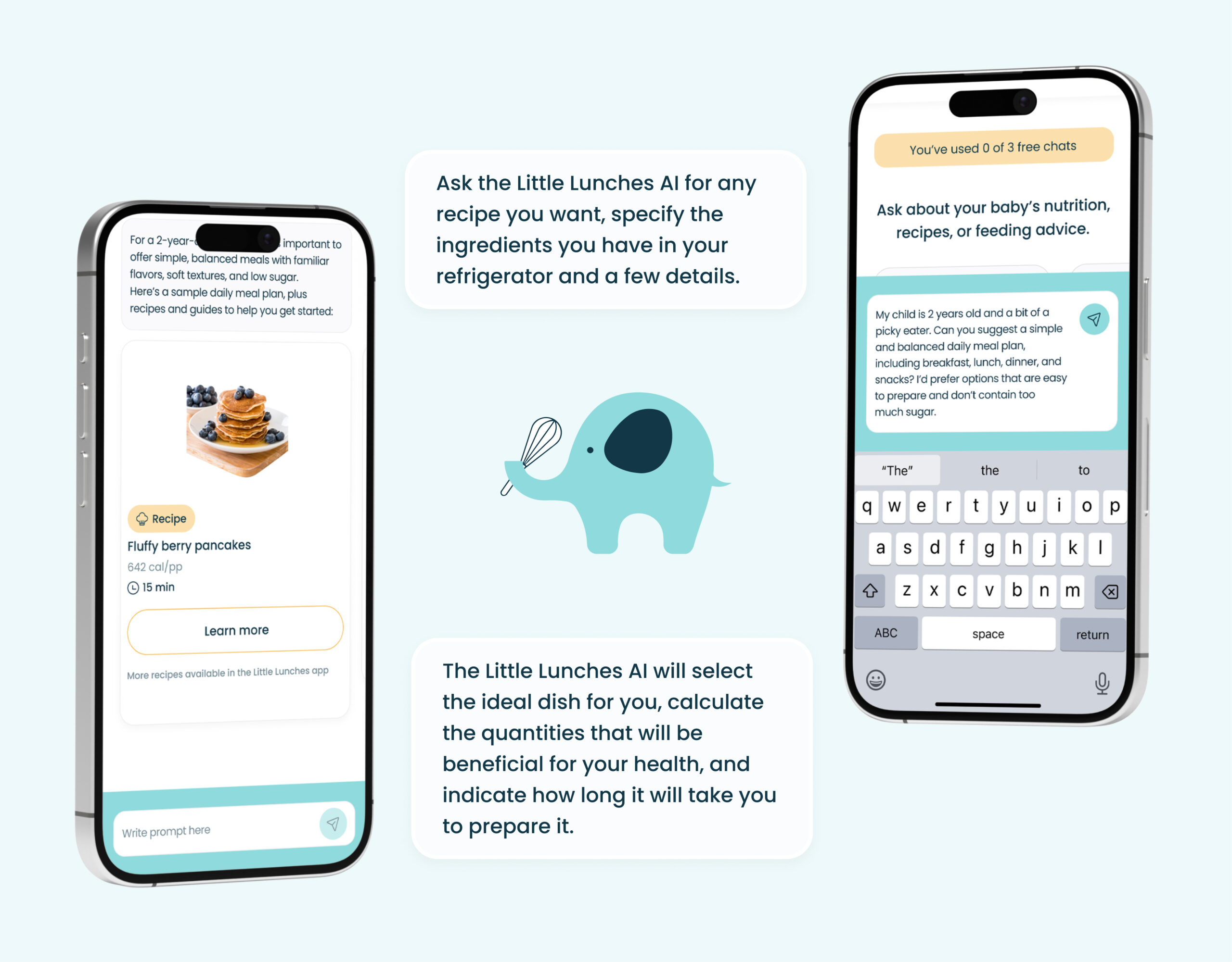
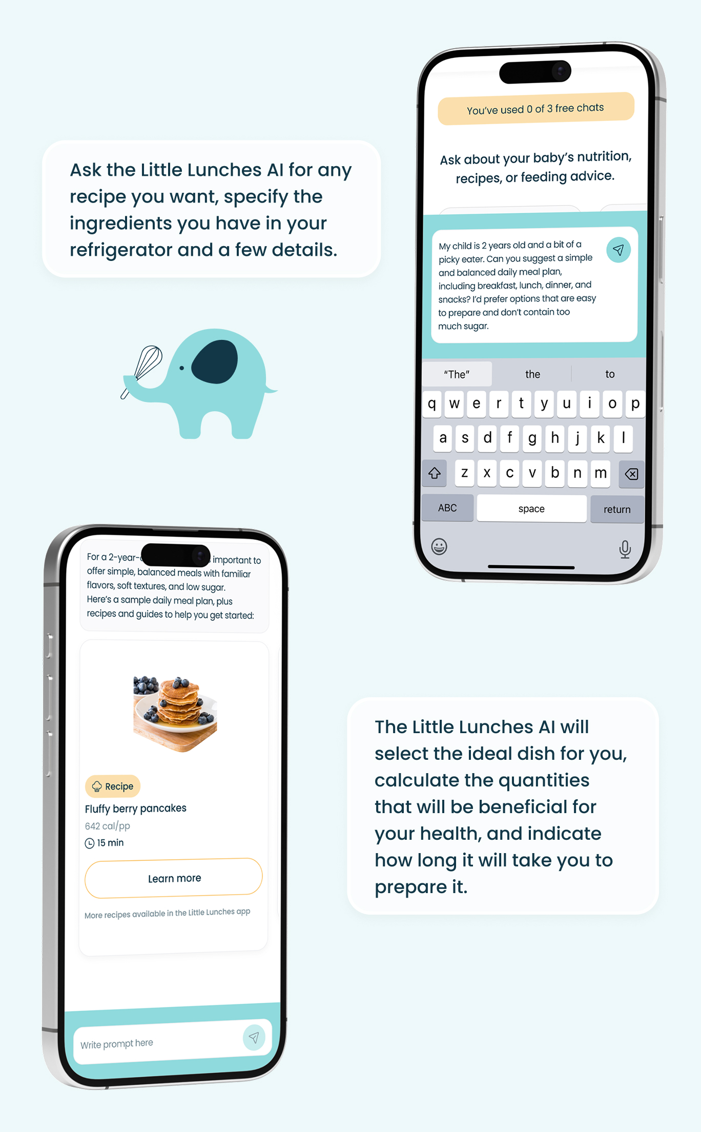
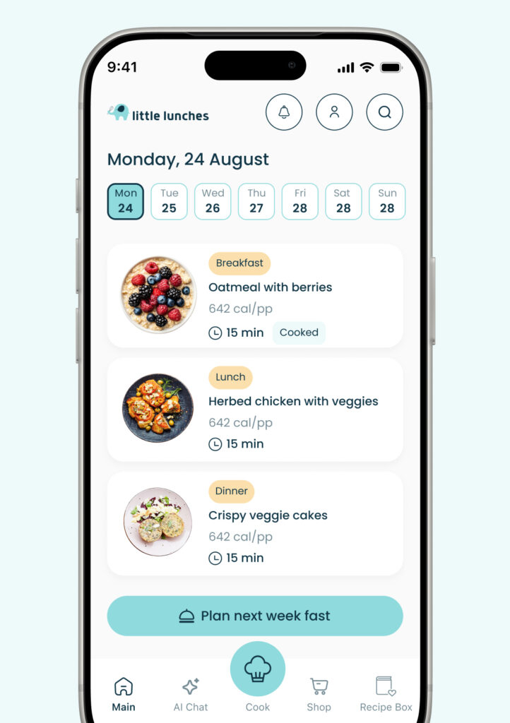
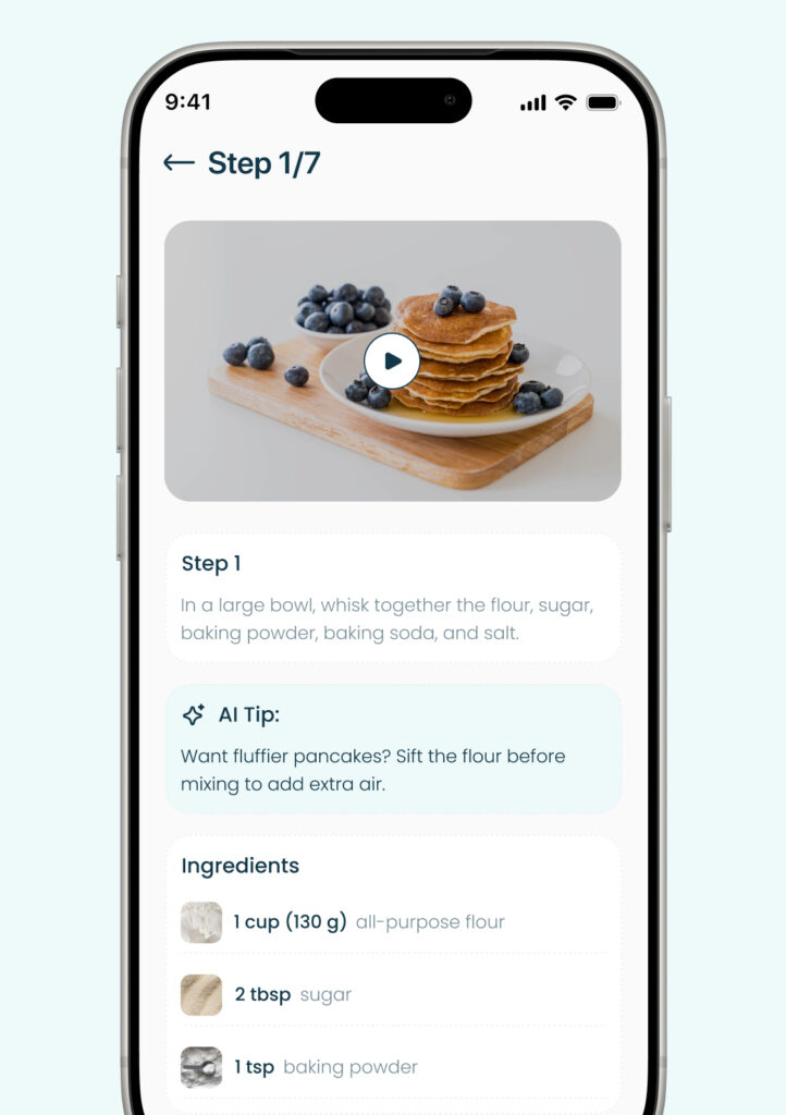
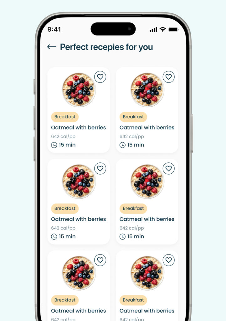
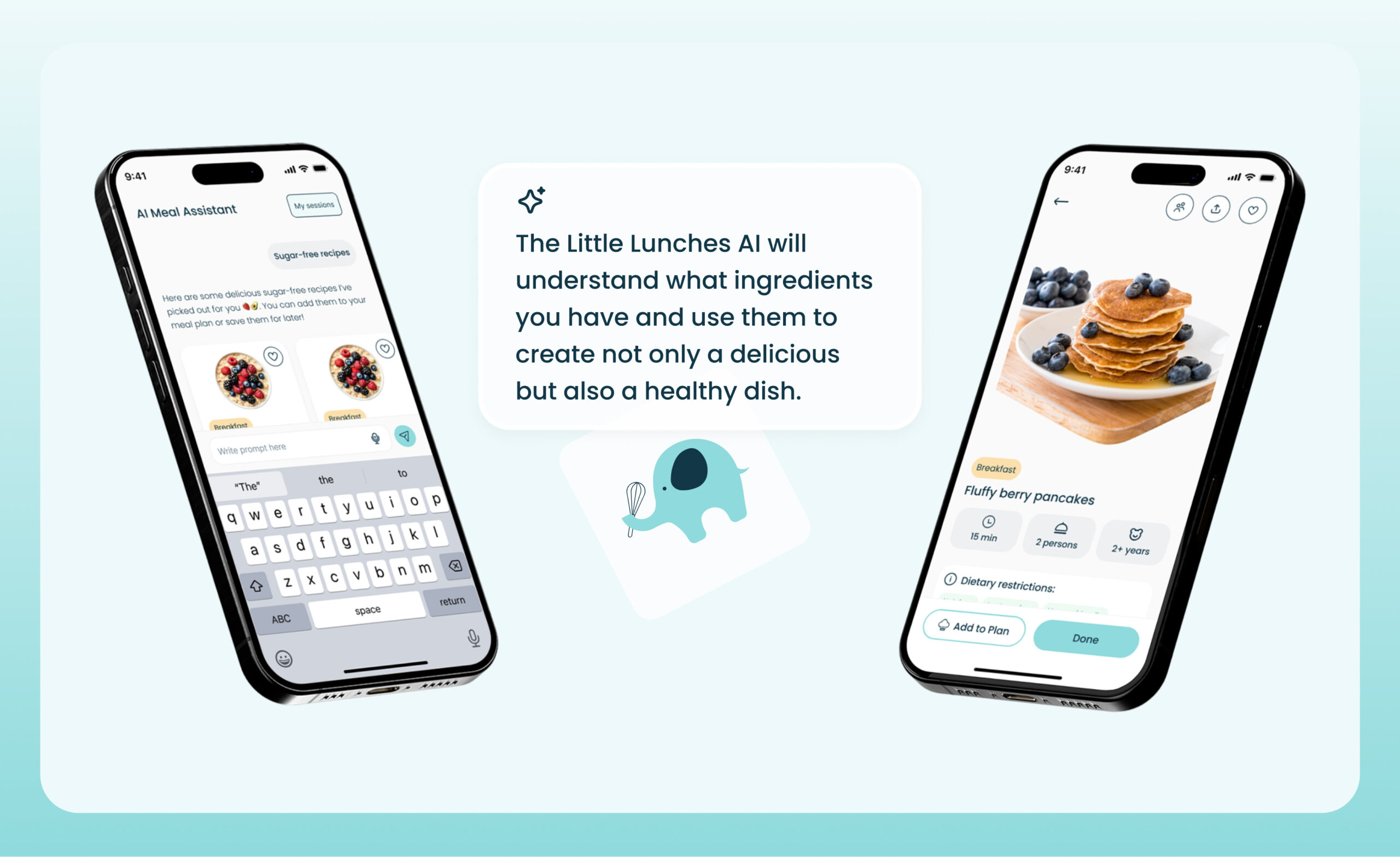
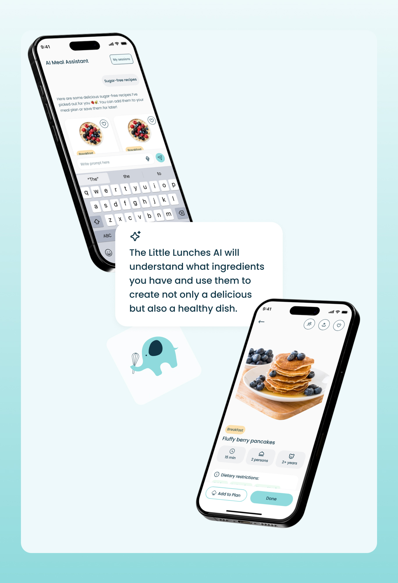
The interface follows a clean, fresh visual language using the brand’s primary color palette, Poppins typography, and a card-based layout system. Below are some screens from the app redesign project.
Website Design
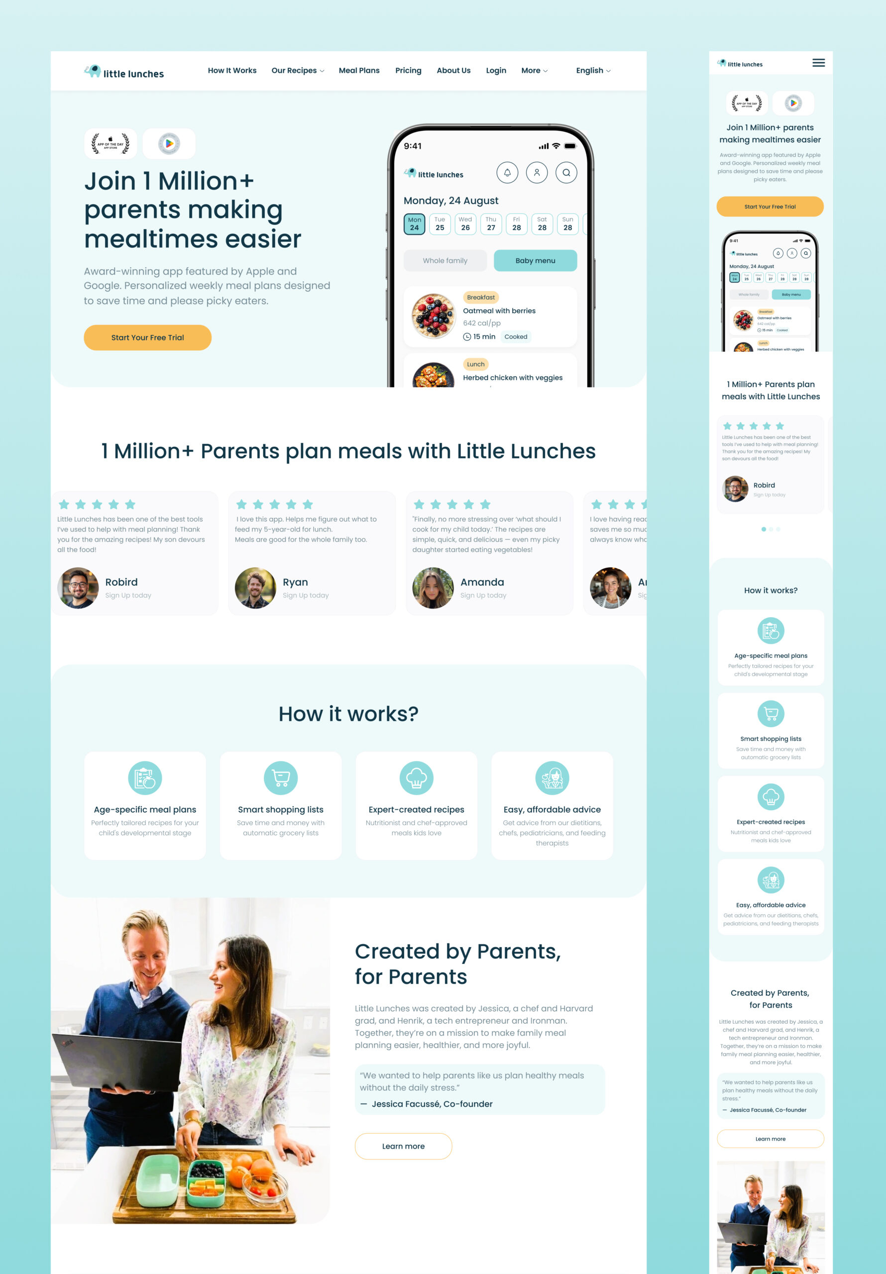
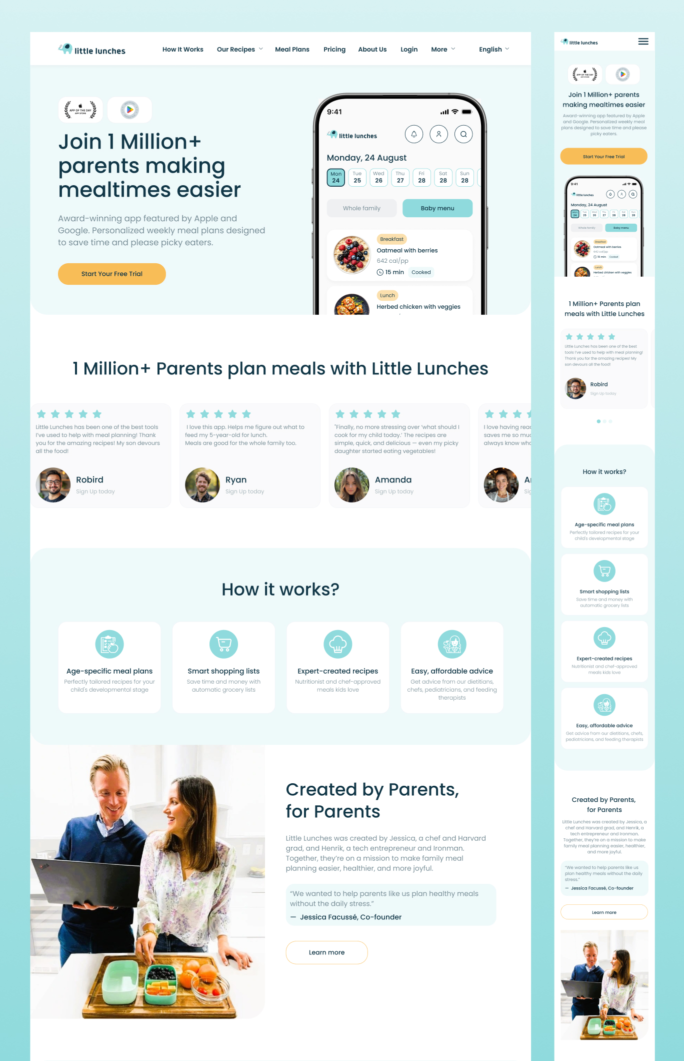
The Little Lunches website was redesigned to align with the updated app identity. It follows the same visual language — Poppins typography, navy and teal palette — while adapting to a desktop-first layout with full responsive support.