Typography
The Little Lunches typographic system is built around Poppins as the primary typeface for all digital products — app and website. Its geometric, rounded letterforms align perfectly with the brand’s friendly and approachable character.
Main Font
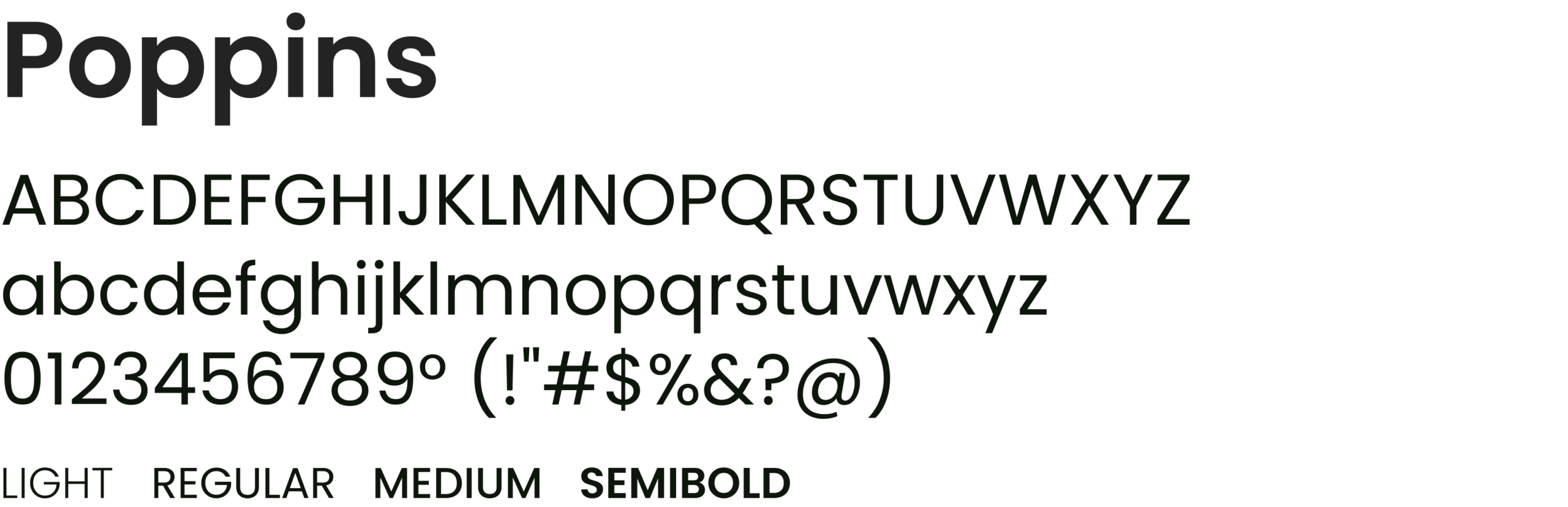
Poppins is the sole typeface of the Little Lunches visual identity. It covers all weights needed — from Light for captions to SemiBold for display headings — maintaining warmth and consistency.
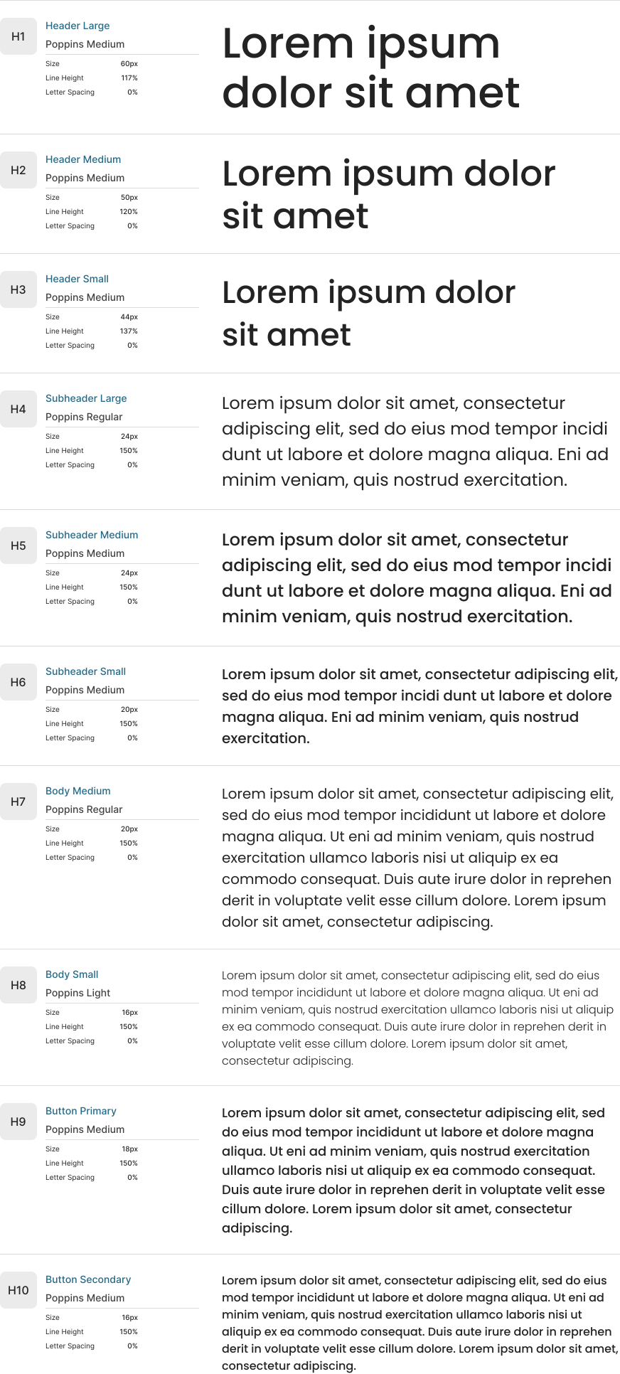
Font Heirarchy – Website
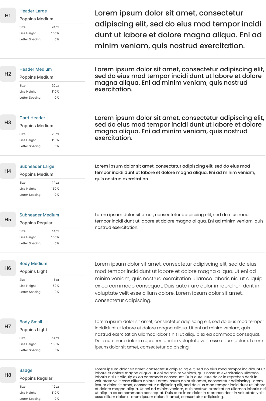
The hierarchy defines a clear structure for headlines, subheadings, and body text. Consistent sizing and weight usage ensure readability and visual rhythm across all surfaces.

Font Heirarchy – App
The hierarchy defines a clear structure for headlines, subheadings, and body text. Consistent sizing and weight usage ensure readability and visual rhythm across all surfaces.